top of page
Logo and Branding Package
Sun Moon Yoga | Aberdeen


Varied Logo Formats
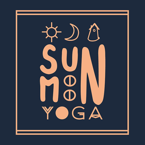
The main logo encompasses the full charter and communicates the purpose and character of the Yoga Business. The logo and symbols that represent the brand name 'sun moon shala yoga.' The secondary option focuses on the symbols with small print type below. The final landscape option is perfect for a smaller format and simple use in documentation. Keeping a consistent feel, the weight of line and structure. Keeping the logo simple with a single and dual colour option along with a full 5 colour palette, font pairing and design guidelines to maintain consistency and quality across all branding for the client going forward.


Colour Palette
I went for a rich but soft palette with warm fleshy tones and cool and dark blue to reflect the yoga teachers goal to connect with your body and re-energise through the practice and teaching. The palette is calm but with the contrast of bright and dark to create a bold look. This gives the client some colours to stick to with any future branding choices, from print to forced colours on social media, adhering to just a few colours will really give the brand recognisability and a professional, sleek finish.
bottom of page
